01
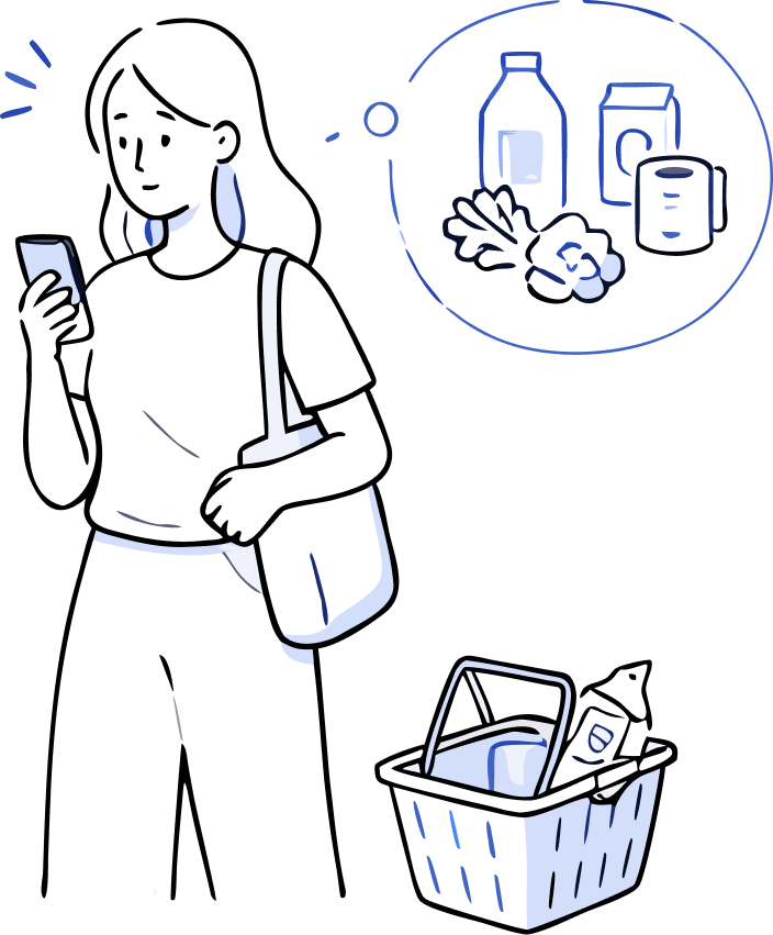
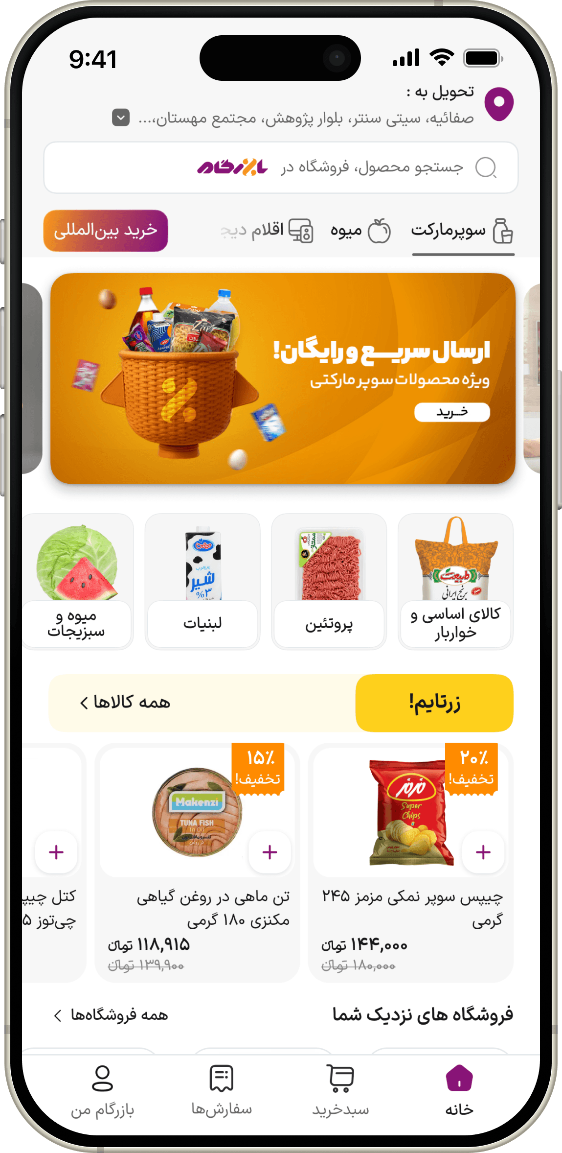
She just needs a few things.
After a long day, she wants to do her grocery shopping.
An end-to-end UX redesign focused on uncovering and resolving usability issues across Bazargam's shopping experience, from session analysis and usability testing to redesigned user flows and UI.
Product Designer / 6-person engineering team (3 backend and 3 frontend developers)
I was the sole designer on the project, owning the end-to-end product redesign from research and testing to UX flows, and high-fidelity UI. Product requirements came from engineering leadership, company stakeholders, and research findings I identified throughout the process.
Designer
Tech Lead
Developers
Bazargam is an FMCG marketplace where small UX frictions would interrupt the purchase journey. From choosing a store to navigating back, finding available products, resolving cart conflicts and finally reaching payment, the user had to repeatedly figure out what the product expected from her.
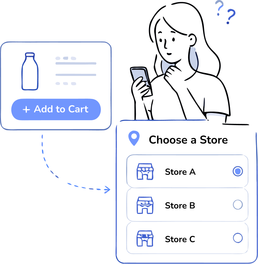
After a long day, she wants to do her grocery shopping.
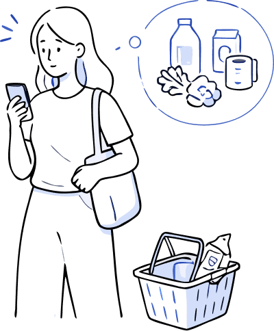
But adding it to the cart isn’t quite that simple.
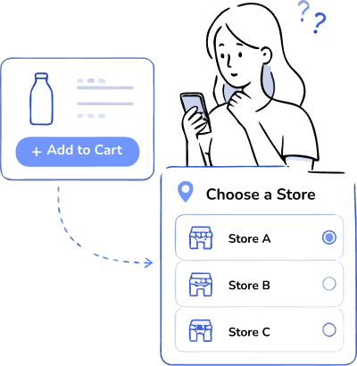
She needs to choose where she wants to buy from.
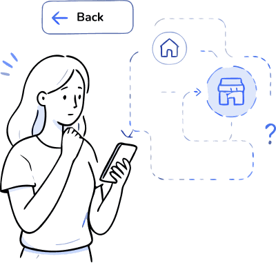
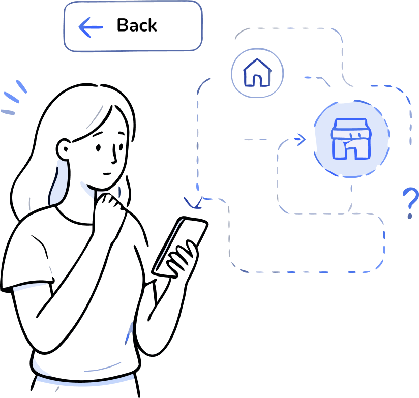
But navigating back doesn't always take her where she expects.
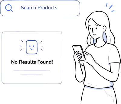
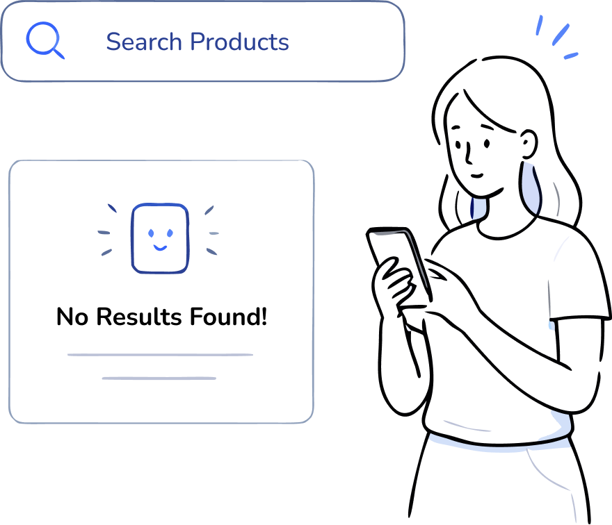
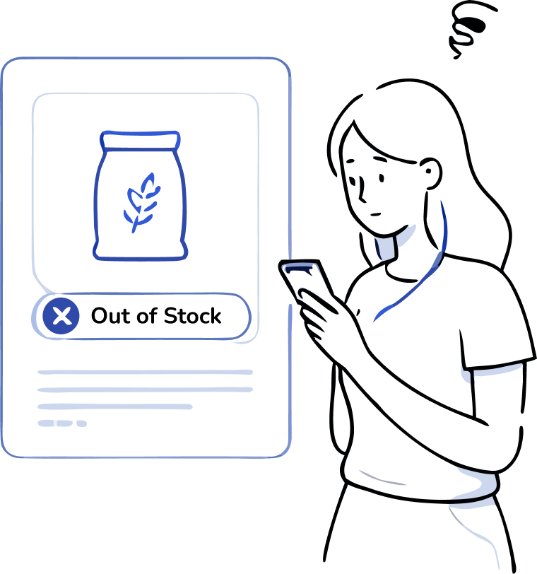
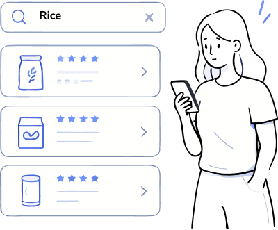
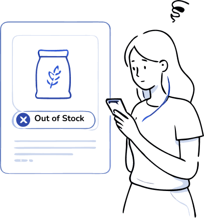
Some products aren't available in the selected store.
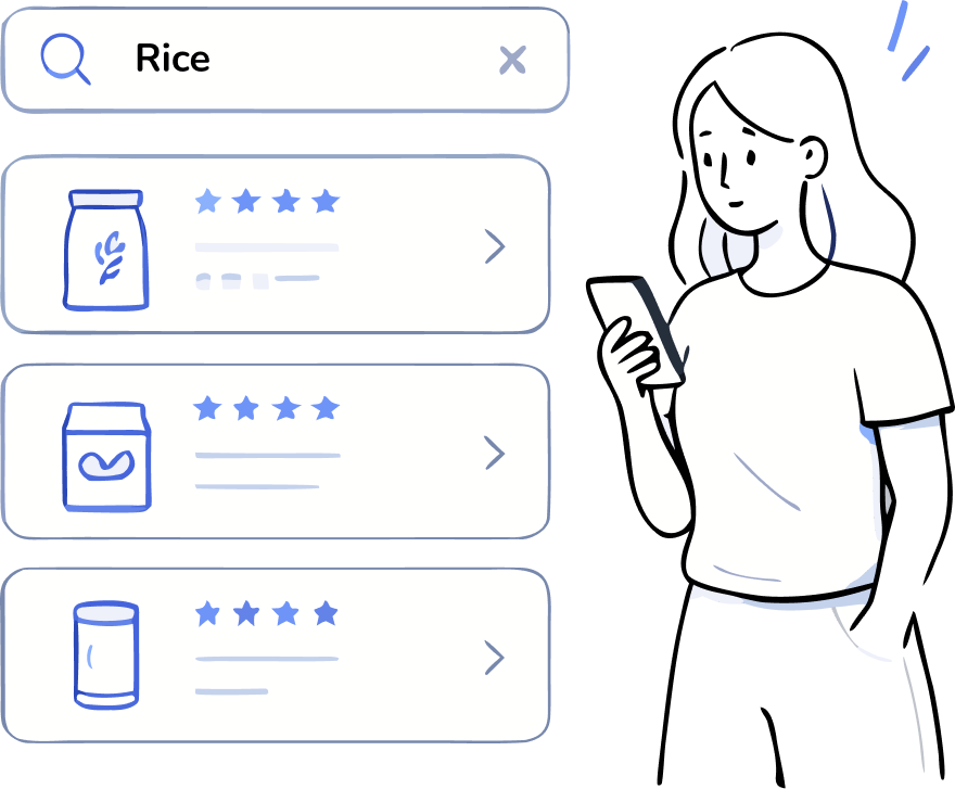
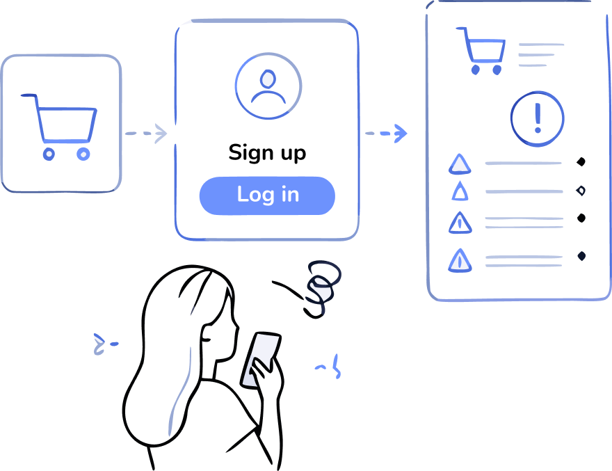
The cart needs to be adjusted before she can continue.
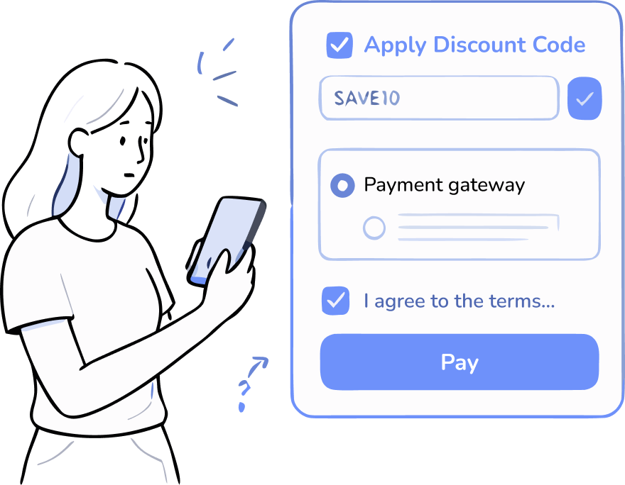
After all the checks, she finally reaches checkout.
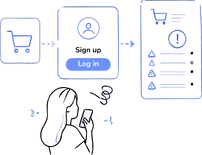
After all the clicks, check and returns, she makes it.
Instead of looking at isolated usability issues, we examined the journey step by step from a new user's perspective. At each step, we asked four questions to identify potential points of friction.
Will users try to achieve the right outcome?
Will users notice that the correct action is available?
Will users associate the correct action with the result they're trying to achieve?
After the action is performed, will users see that progress is made toward the goal?
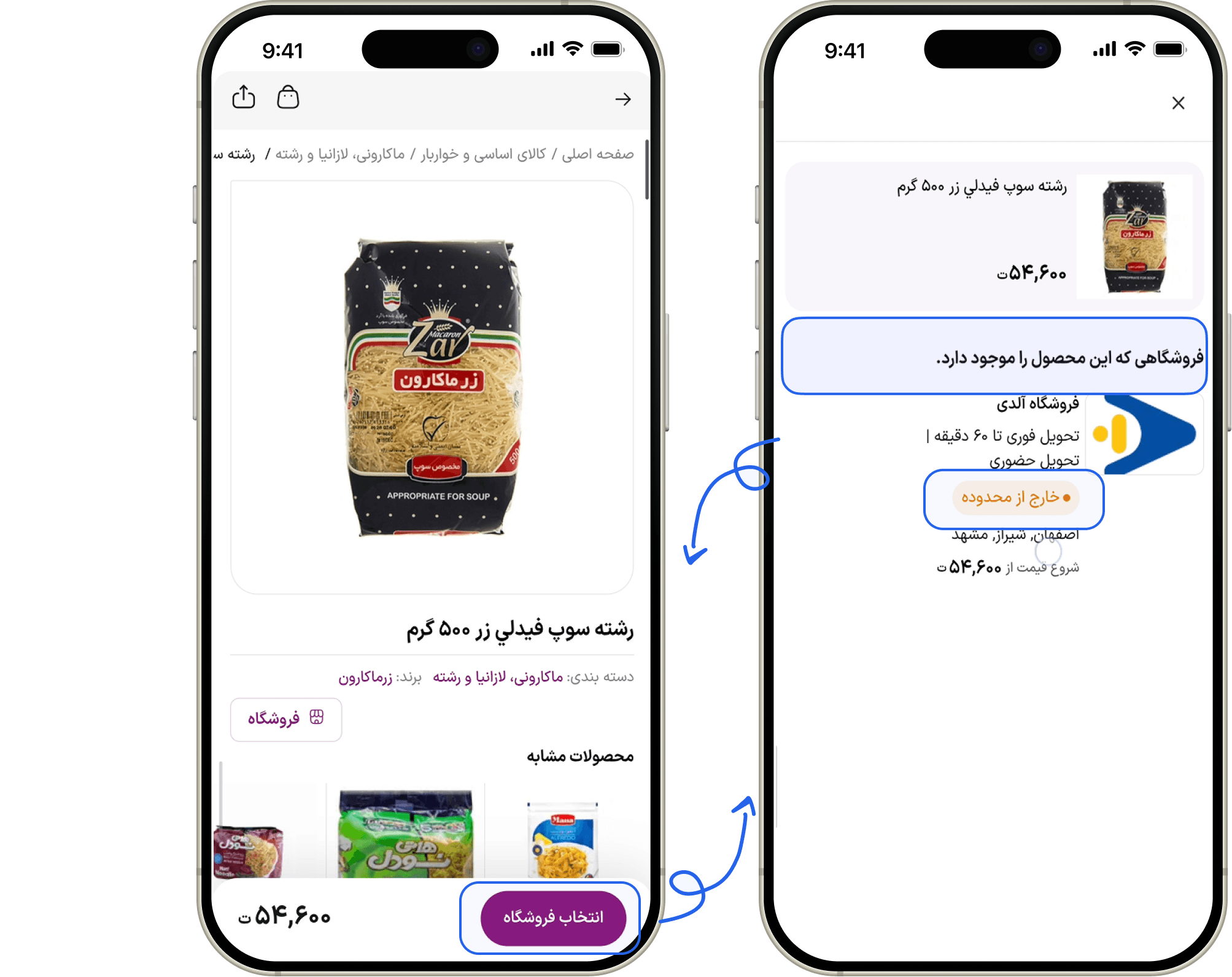
The flow could trap users between store selection and product details.
Supporting evidence
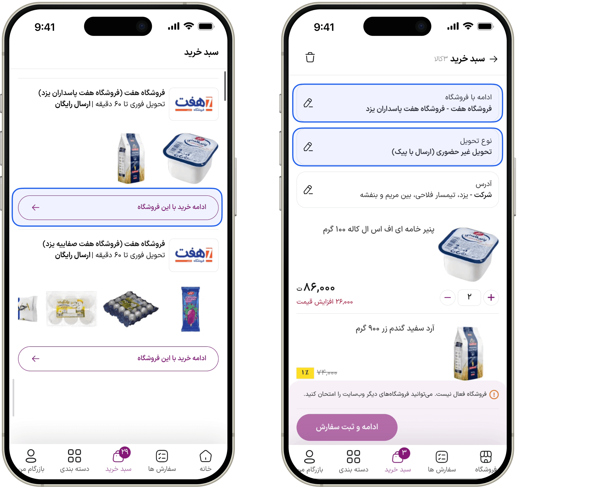
Several interface elements suggested actions that produced different outcomes than users expected.
Supporting evidence
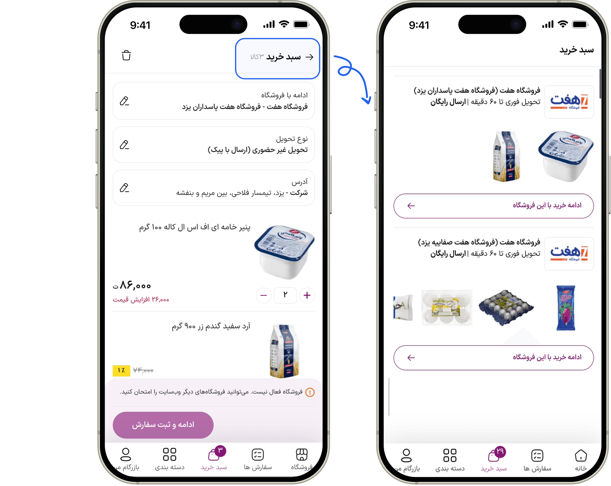
Back navigation in most of the pages repeatedly broke users' sense of place.
Supporting evidence
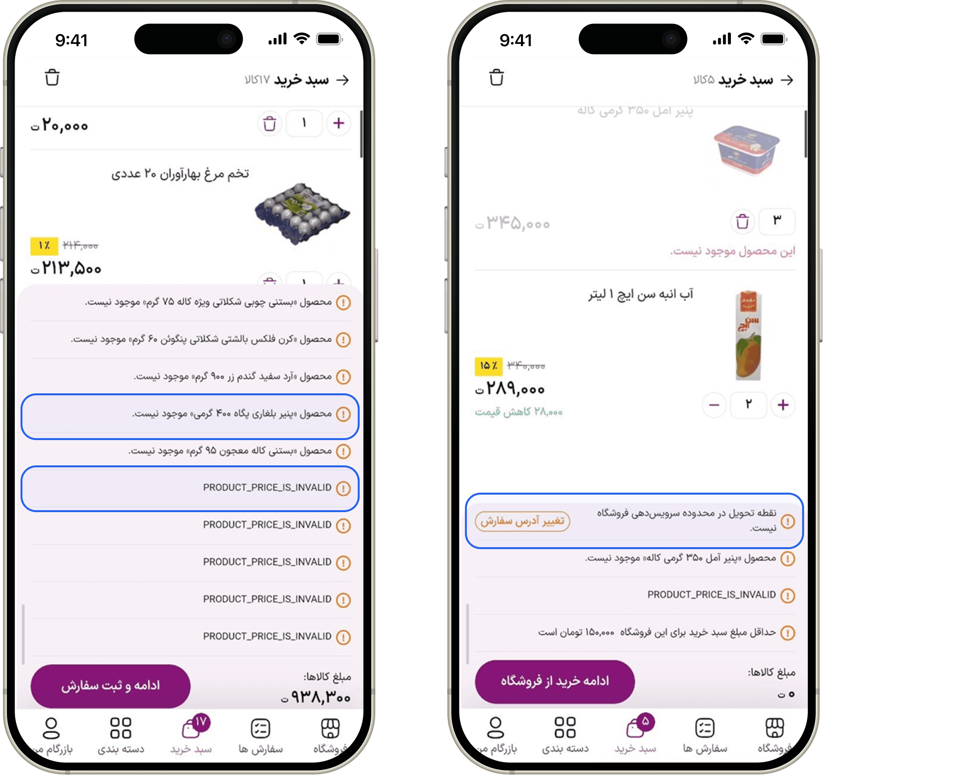
The interface reported problems but failed to help users recover.
Supporting evidence
Users may struggle to find the right category because back navigation behaves inconsistently.
The IA may not match users' mental models of FMCG shopping.
Users may have to navigate more than necessary to find a product.
More than 30 real user sessions were reviewed to understand whether the interaction breakdowns identified during the walkthrough also occurred in practice.More than 30 real user sessions were reviewed to understand whether the interaction breakdowns identified during the walkthrough also occurred in practice. What users actually did confirmed some of our concerns and revealed another pattern we hadn't anticipated.
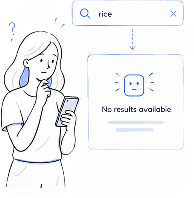
Users immediately encountered a "No results available" message before typing anything.
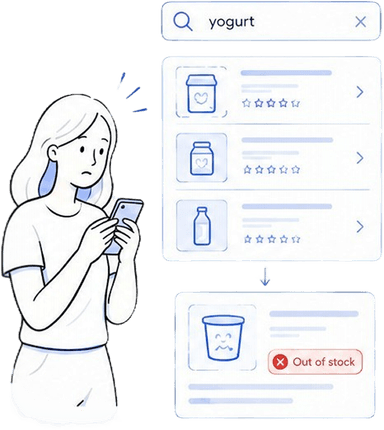
Product availability was not visible inside search results, requiring users to open product pages simply to discover items were unavailable.
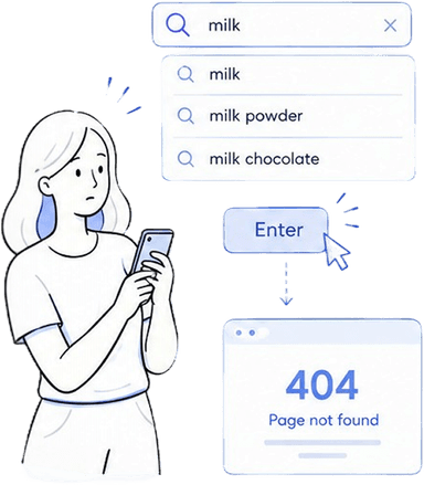
Many users pressed Enter instead of selecting instant suggestions, leading to a 404 page because no search results page existed.
We initially thought product discovery was mainly a navigation problem. Session recordings showed that for many users it wasn't. They bypassed navigation and went straight to search.
Session recordings showed us where behavior broke down. Usability testing helped us understand the reasoning behind it.
Task 01
Success Rate
80% (4/5)
Misclick Rate
40% (2/5)
Assisted Completion
20% (1/5)
Task 02
Success Rate
40% (2/5)
Misclick Rate
100% (5/5)
Assisted Completion
60% (3/5)
By combining the walkthrough, session recordings, and usability testing, we found five recurring patterns behind the friction.
Many users bypassed categories and went straight to Search, treating it as the fastest route to a known product. But when Search itself introduced friction, that shortcut became another barrier to purchase.
Once users decide a product is worth buying, they expect the next step to preserve that decision. Introducing another unresolved choice at this point interrupts purchase momentum and forces them to reconsider something they thought they had already decided.
Users build an expectation of what they are buying as they move through the journey. When product availability, store context, required actions or error states change later in the flow, they have to reconstruct that context instead of simply progressing toward payment.
When purchase conditions changed, users were told what went wrong but not what to do next.
Navigation and interaction cues often led users somewhere different from where they expected to go.
Whether users were searching for a known product or exploring for a deal, they expected Bazargam to preserve their purchase intent as they moved through the journey. Instead, UX frictions repeatedly forced them to stop and figure out what to do next.

EFFICIENCY DRIVEN
I know what I need. I just need the fastest way to get it.
Core Goal
Find required products quickly and complete the purchase with minimum friction.
Pain Points
VALUE DRIVEN
Show me good opportunities, and I'll decide what I need.
Core Goal
Discover valuable deals and decide what is worth purchasing.
Pain Points
Two different goals, one shared point of failure – the experience could not hold a consistent shopping context across the journey.
What should we solve for users?
What could we realistically change?
Why is it valuable for the business?
Research set the direction. The Three Lenses kept each response grounded in a user need, a real delivery context, and a product hypothesis.
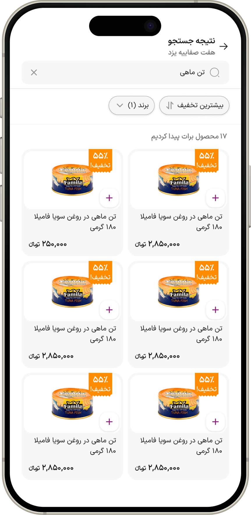
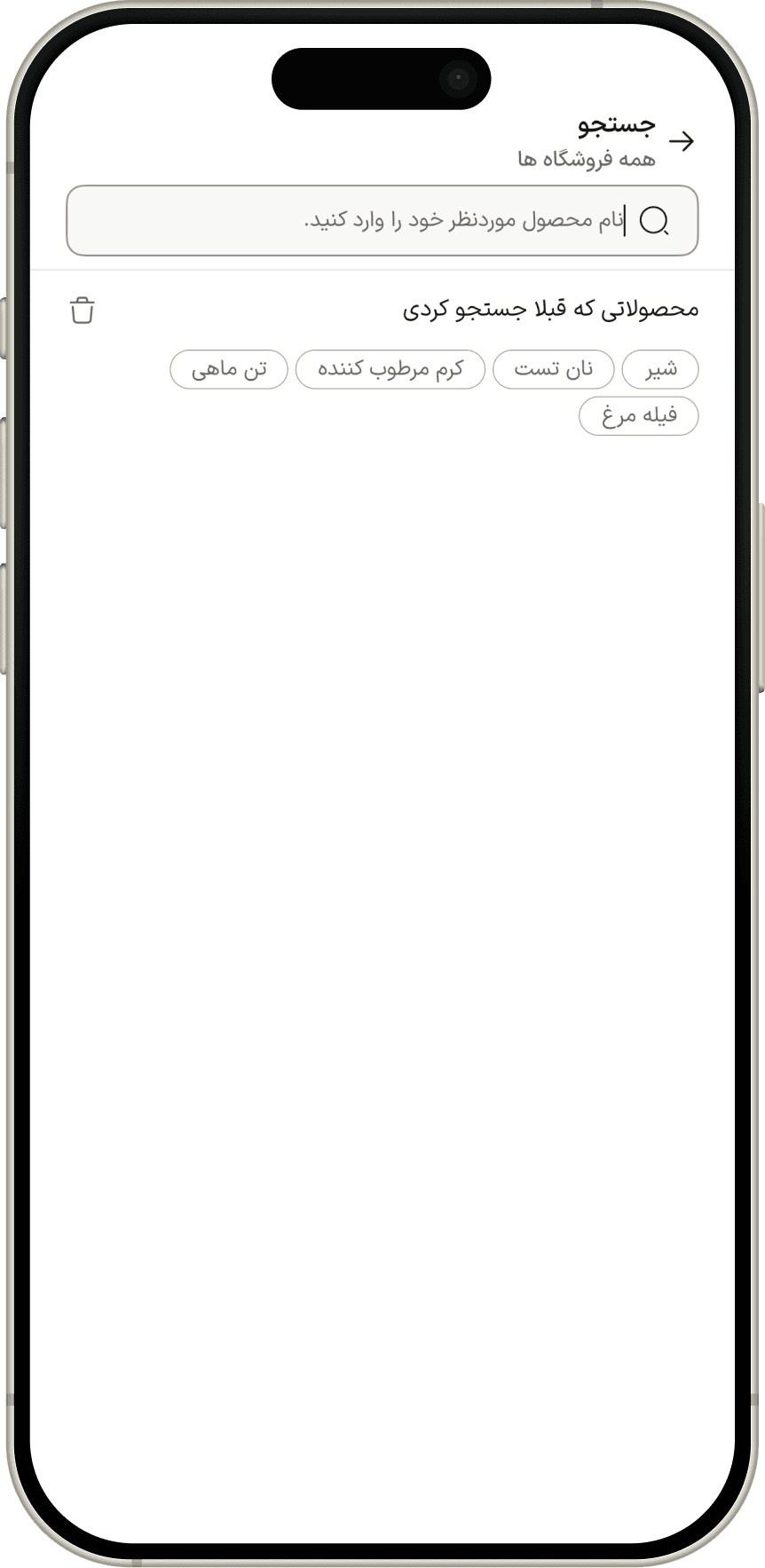
We improved Search and product information to make finding and evaluating products easier.
Users needed a faster way to find and evaluate products, especially when Search was their preferred shortcut.
Builds on the existing product-indexing layer already powering categories.
Better discovery could reduce search abandonment and increase add-to-cart opportunities.
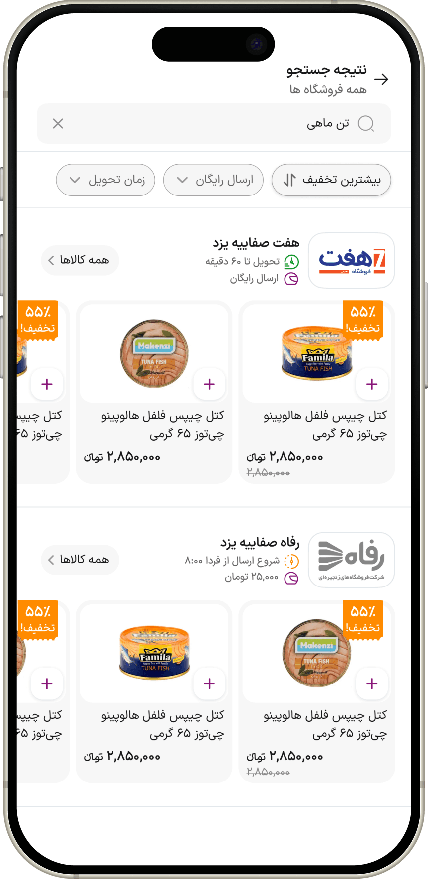
We clarified store selection, product availability, and add-to-cart actions to make product selection more predictable.
Users needed clear product, availability, and store context before committing to add a product.
The solution had to account for store/service-area logic and product availability states already present in the product.
Making purchase conditions clearer could reduce failed or interrupted add-to-cart attempts.
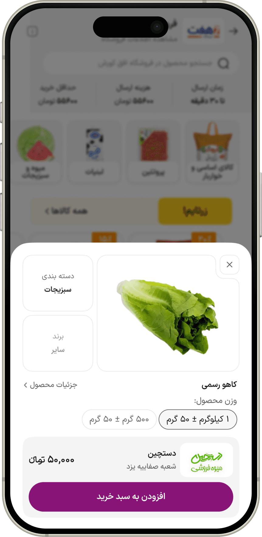
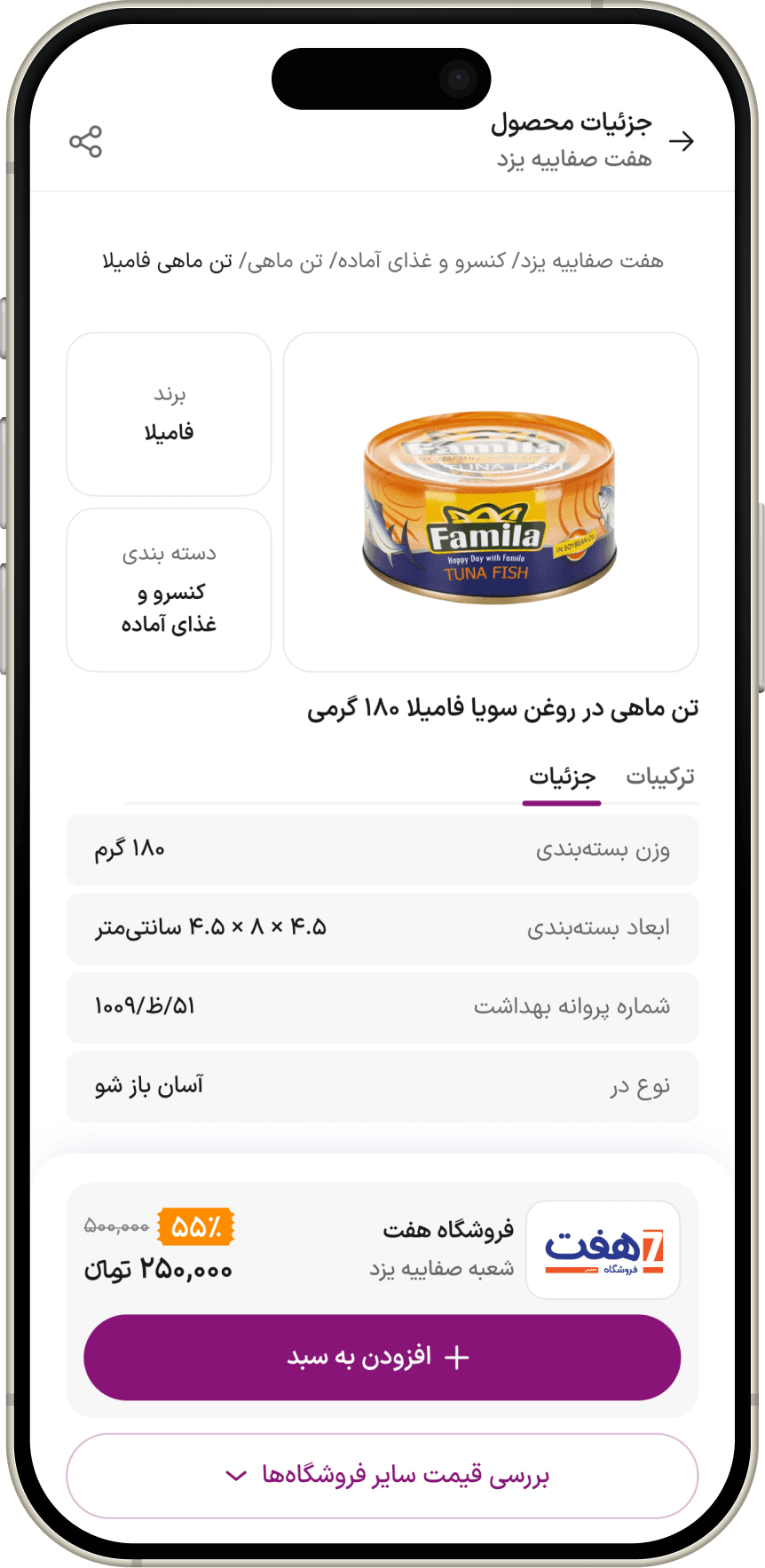
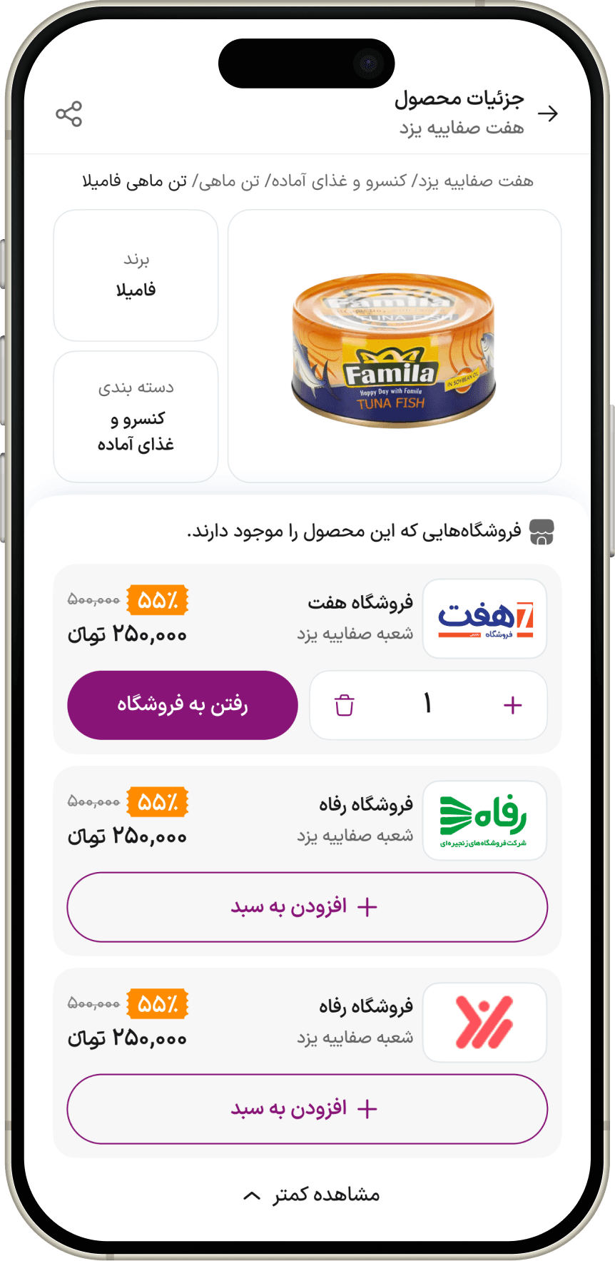
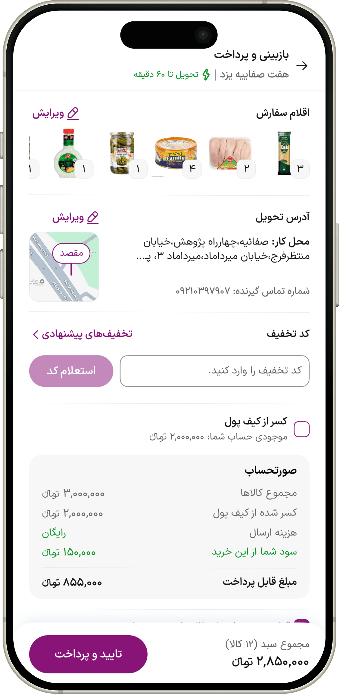
We redesigned the cart and checkout experience to preserve context and make the path to purchase clearer.
Users needed to maintain a clear sense of their choices and progress as they moved toward payment.
The redesign required rethinking existing Cart and Checkout actions, including removing or redesigning actions that did not support the intended flow.
A clearer, more focused path to payment could reduce friction before purchase completion.
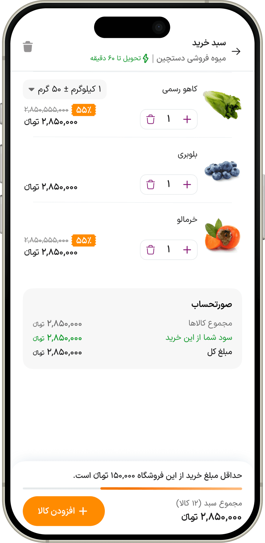
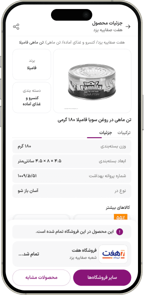
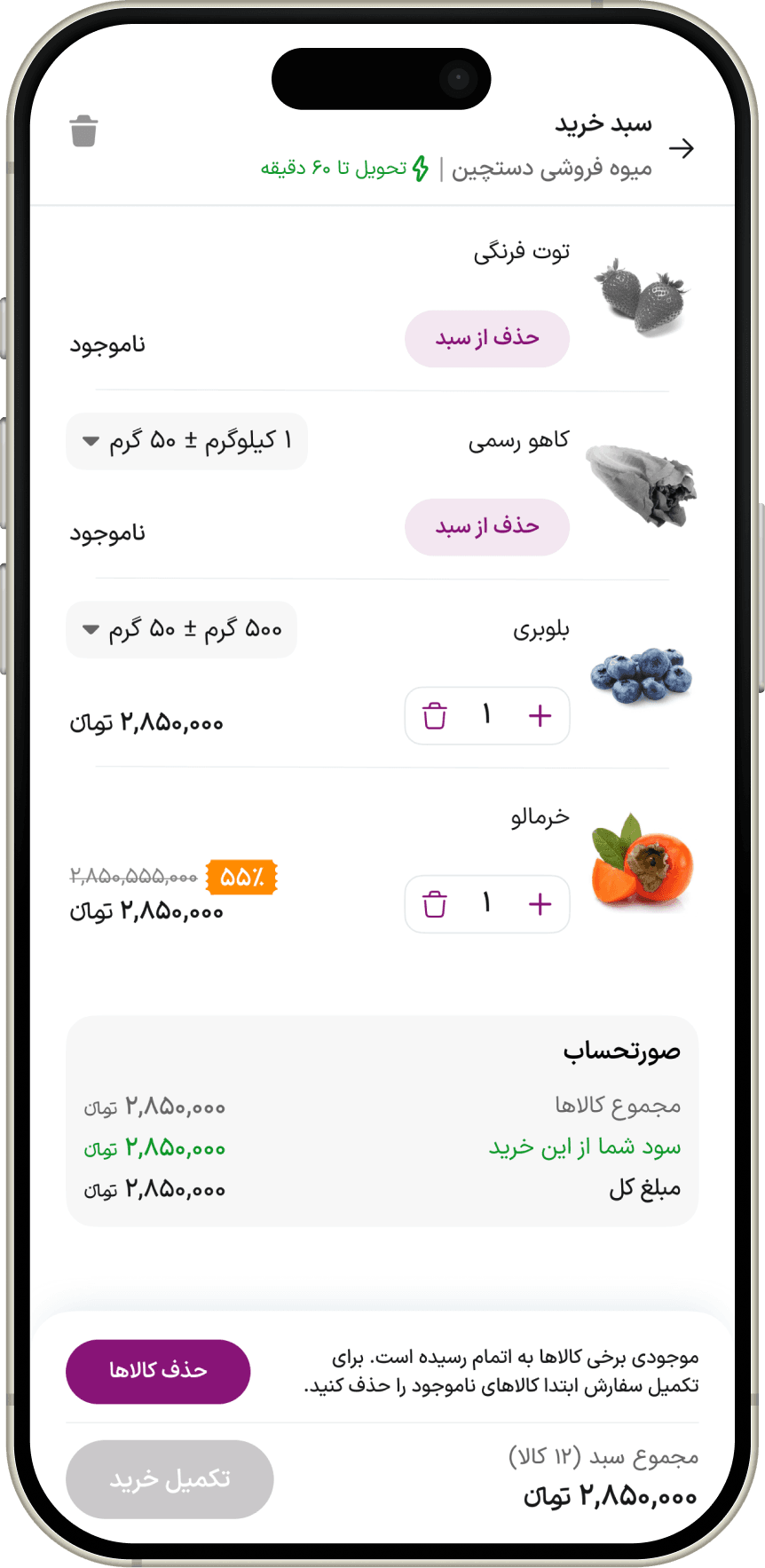
We redesigned availability and error states to give users clearer feedback and a way forward.
Users needed to understand what changed and what they could do next when purchase conditions changed.
Recovery states had to work with existing availability, store, product, and checkout conditions.
Giving users a clear recovery path could prevent avoidable dead ends during purchase.
Across the redesign, we also aligned interaction patterns with users' existing mental models, making navigation and key actions more predictable.
Pattern 05
By tracking key product events and analyzing the user funnel, we can measure how the redesign affects progression from search and product discovery to cart and checkout.
Expected Impact
Clearer product information, more visible product availability, and more accessible add-to-cart actions should reduce hesitation and friction at the point of product selection.
Expected Impact
Improved search feedback, clearer search results, better product visibility, and a proper recovery path for unsuccessful searches should help users continue their shopping journey.
Expected Impact
A clearer cart state, better visibility of product and availability changes, and more predictable interactions should reduce uncertainty and friction between cart and checkout.
Expected Impact
Reducing unnecessary friction, clarifying required actions, improving error recovery, and making the checkout state easier to understand should help users progress through checkout.
The redesign started with individual usability issues. But as evidence accumulated, they revealed a larger problem: Bazargam couldn't consistently preserve the user's shopping context from discovery to checkout. I learned to look beyond individual screens and understand the journey as a whole. From now on, I'll understand the journey first, then redesign the interface.